In what ways does your media product use, develop or challenge forms and conventions of real media products?
The indie music genre is known to be unique and artistic in the way is conveys itself in a very unique yet powerful way. It rejects typical flashy and dramatic traits associated with the pop genre.
Take Lana Del Rey for example:

She is known for her sensual music paired with her retro sense of style. Even her music videos have a vintage look with the use of grainy film stock, distorted/heavily filtered colours and extended shots.
Take Lana Del Rey for example:

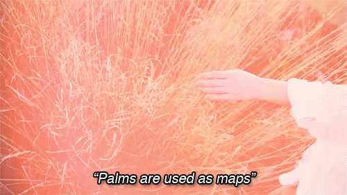
This video style used in Summertime Sadness is visually pleasing and is aesthetically similar to Birdy's Shelter. Here, the narrative follows the character running through a forest environment, and the emphasis again is on one single character.
I took inspirations from indie music videos like these in order to conform my product to the genre. I believe because the music and artists were very similar in identity and style, the effects worked amazingly.
 |
| Comparison of mise-en-scene |


Following my research on the conventions of music videos, I applied Andrew Goodwin's theory to my music video to guarantee it conforms to all the aspects of a real media product.
1) Music videos demonstrate genre characteristics
As mentioned above, the grainy film stock, lens flares, slow motion, hand held camera and several other aspects of mise-en-scene all add up to it being a product of the indie genre.
2) There is a relationship between lyrics and visuals
 |
| The colours fade with the lens flare |
 |
| Here, the deer are the 'children' on the forest |
 |
| Close-up on the hand |
3) The demands of the record label will include the need for lots of close ups of the artist
The video starts and ends with a close-up of the character's face, with frequent ones in between.
4) There is frequently reference to the notion of looking and voyeuristic treatment of the female body
 |
| The camera lingers on her legs and body. |
 |
| Female sexualisation in Beyonce's Single Ladies |
5) There is often intertextual reference
The character, costume and setting is repeated in the artist's digipak and magazine advert (see below).
Whispers has a noticeable to other music videos. There is almost footage of singing, except for a line at the end. This is because I wanted to focus on the narrative and cross cutting from a performance sequence to the storyline would alter the continuity that I wanted to sustain throughout my film. It therefore utilizes Todorov's 3 part narrative structure, with a clear beginning(forest), middle(journey) and end(city).
 |
| The video ends with our character having reached the city. |
This video also inspired me to add a sound bridge at the beginning and end of my music video where the diegetic sounds of birds chirping in nature fades to the non-diegetic song(Also seen in Milky Chance's Down by the River), and then back to diegetic sounds of urban environment.
________________________________________________________________________
The album cover on the digipak took similar inspirations from real media products. From my research, I found the most common features on album covers:
- Close-up picture of artist
- Name of artist boldly presented
- Name of album in smaller if not same sized font
Print products of the indie genre also seem to have these features in common:
- Distorted/heavily filtered colours
- Illustration
- Creative fonts
- Grainy image

 |
| In comparison to another indie album |
Like all other artists, I used the same image of my cover to advertise on my magazine advert.
 |
| Institutional information and format is followed. |
No comments:
Post a Comment